Poll: Box Art Brawl #75 – Resident Evil: Deadly Silence

Welcome back to Box Art Brawl, our regular poll to find out which region got the best cover art for a particular retro release.
Last time, we looked at Capcom’s DS gem Ghost Trick: Phantom Detective in honour of its 10th anniversary (in the West). The North American cover stormed it with over 60% of the vote, leaving Japan with a quarter and Europe to mop up the rest.
This week we’re sticking with Capcom and the Nintendo DS for another anniversary bout. Yes, Resident Evil: Deadly Silence launched fifteen years ago on 19th January 2006, bringing Shinji Mikami’s PlayStation original to Nintendo’s handheld in time for the series’ 10th anniversary. Using the system’s touchscreen and adding a couple of mechanics to the original framework, Deadly Silence is an underrated little port and remains an excellent way to revisit the shlocky B-movie horror and mid-’90s visuals of the game in its original guise (as opposed to the beautifully slick, reimagined REmake).
The Resident Evil series is a regular in the ‘Brawl, of course, with no fewer than four previous appearances to date; variants of Resident Evil 0, Resident Evil 3: Nemesis, Resident Evil 2, and Resident Evil 4 have all battled for your approval in the past.
So, pack your (Jill) sandwiches, and let’s head back into the Spencer Mansion…
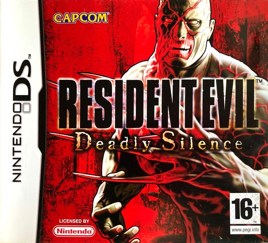
Europe

The European cover puts the grisly Tyrant on a suitably blood-red background with its mutated claw visible, though largely covered by the logo. We get a good view of his dynamite abs below, though, and his impressive set of gnashers above.
Not a huge amount going on here. We like the deep red and the overall impression the big bad delivers, although it’s a little bit in-your-face and doesn’t convey much of the tension you’ll feel while exploring the mansion’s drab corridors. Gotta love the little yellow splash of that Capcom logo, though.
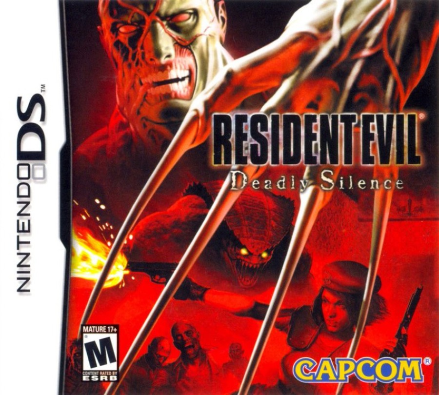
North America

The North American cover adds more action, with Jill Valentine mid-leap with two guns in her hands, one firing. She’s flanked by a horde of zombies (and an unsavoury-looking reptilian chap with yellow eyes) while the Tyrant looms over the entire collage. His big limp claw hangs menacingly over the image, although we’re not sure what he’s doing with it. Throwing shapes, perhaps?
The logo is identical but has shrunk to show off more of the art. Overall, it’s fine, but more generic and less focused than the European version.
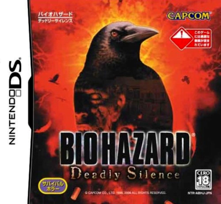
Japan

The Japanese cover goes for something a little more thoughtful; something that evokes the evil in residence without showing the final boss of the game or a gung ho, gun-firing hero. An ominous crow takes centre stage framed by a burning orange-red light, and in the darkness of its silhouette you can make out the up-lit face of a zombie and the vague outline of the Spencer Mansion.
Bearing in mind this was a game released at the time of the iconic original’s 10th anniversary, it’s reasonable to assume that everyone already new what ‘Biohazard’ was, so this more evocative cover would have worked well. While it’s not as immediately eye-catching, we admire how it avoids the obvious.
So, you’ve seen the options, but which one resides in your heart? Pick your favourite and hit ‘Vote’ to let us know below:
Fifteen years! Feel free to share your memories of this smaller scale REmake below. We hope you’re all keeping safe and well — have a great week and we’ll see you again for another Box Art Brawl.
