Nine Interior Design Rules To Break

Break the rules of interior design.
Unsplash
We’ve been given so many rules about designing our homes, such as always painting the walls white and that your dresser, bed, and nightstands must match. But following the rules of interior design often leads to visually uninteresting spaces. So, do we need to listen to everything we’ve been told? After all, they say that rules are meant to be broken.
But if you’re going to break the rules, you need to do it well. So I spoke with some of the top interior designers and experts to learn how to break some of the most common interior design rules we’ve all heard over the years.
Rule: Matching Everything
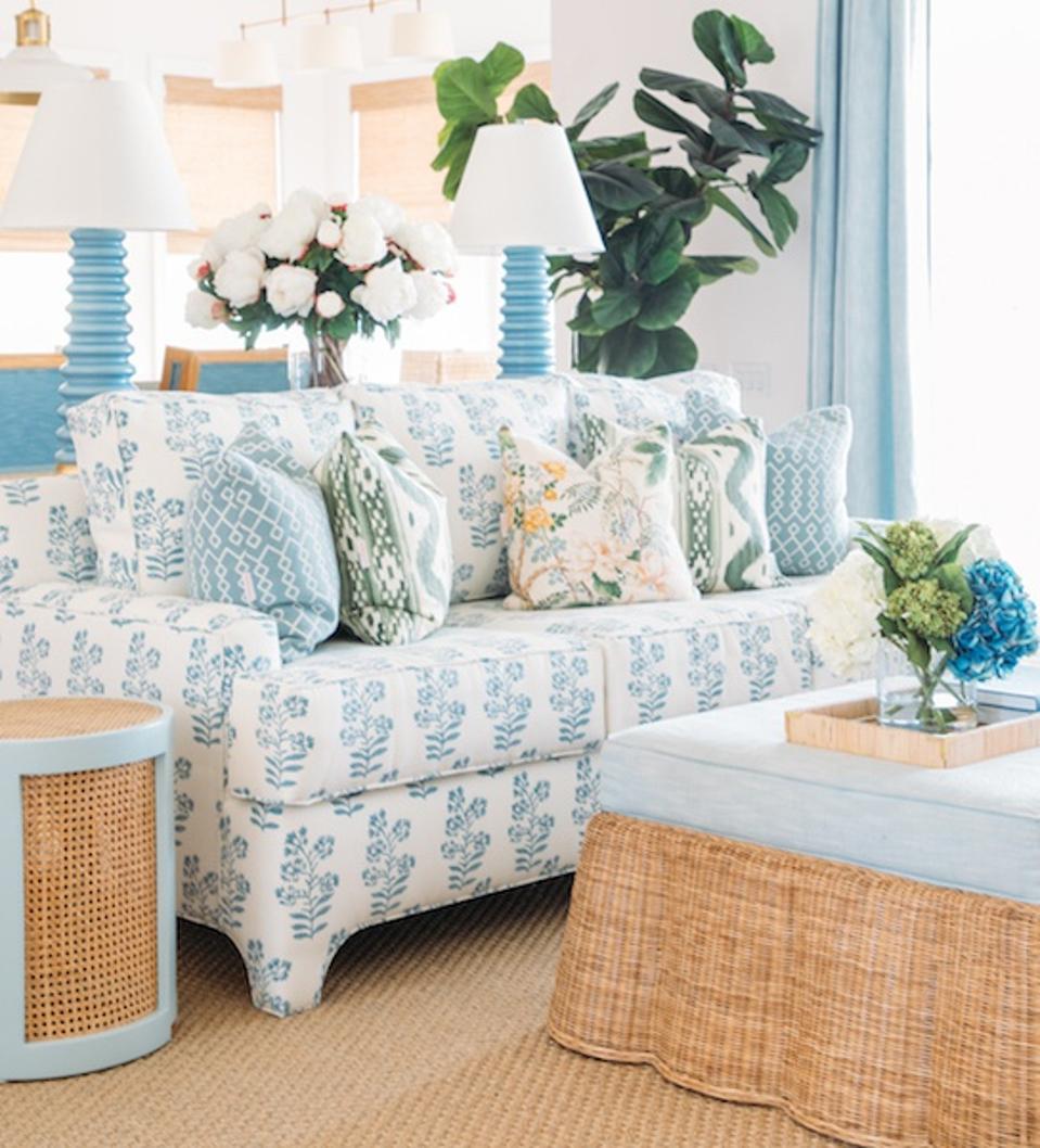
Not everything has to match perfectly
Lawrence Te/SocietySocial
Do the drapes need to match the rug? Absolutely not. No matter what type of room you’re trying to decorate, it’s best to mix things up. According to Roxy Te Owens, founder and creative director of Society Social, “Matchy matchy may feel right but the design magic is in the mix,” she explains. “Don’t be afraid to mix metals, neutrals (clients have been terrified to mix white and cream!), textures, prints, and old collected pieces with the new!”
Owens isn’t the only proponent of mixing it up. Andrea DeRosa, principal of Avenue Interior Design notes matching furniture throughout a room hasn’t been on trend for quite a while. “Think the matching nightstand/headboard/dresser suite,” she says. “But we’ve seen a trend in recent years where the design of an interior has become overly homogenized, almost too carefully curated. Your living room shouldn’t look and feel like your master bedroom. And your master bedroom shouldn’t look and feel like your home office. We’re big believers in having an overarching design throughout a space, but leave room to mix it up.”
MORE FOR YOU
So if you can’t decide between two or three things, why not go for all of them?
Rule: White Paint Everywhere
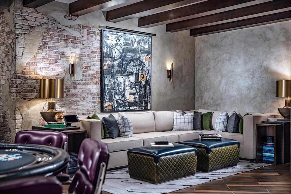
Opt for color
Avenue Interior Design
Along the same lines of overly matching furniture, DeRosa says too much white isn’t a good thing. “Whether renovating or building from the ground up, our instinct is to keep walls and ceilings white. But while we will forever love the fresh, timeless look of a crisp white interior, fewer things bring instant joy than color.”
The use of color doesn’t need to be overly bold. Sandy terracotta, dusty sage, or a cheery, sun-washed yellow are great alternative options. “As a result, these colors infuse a serene, yet energetic warmth to an interior,” she explains.
However, DeRosa insists it’s important to resist the urge to paint every room a wildly different color. “Select two to three hues with tones that complement each other to create a sense of unity.”
Rule: Minimalist Art Framing
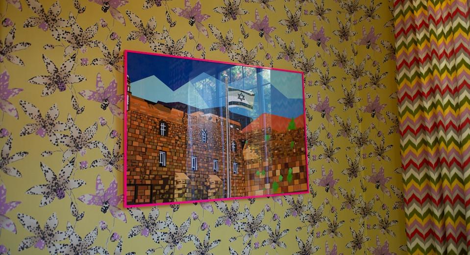
A piece painted by Elizabeth Sutton in a bright pink frame.
Liz Savetsky
If your art is interesting, it deserves an eye-catching frame. So, whether you are framing a piece for a gallery wall or just as an accent— artist, and designer Elizabeth Sutton believes that going for a basic black, white, or metal frame is a rule meant to be broken. “I feel like people don’t have enough fun playing around with framing. I love matching a very modern print with a traditional frame,” she says. “Most people match the art style to the frame, but I love mixing and matching. Like one of my geometric florals, with a mat and a gold traditional baroque style frame. Super chic and unexpected. Or using a pop of color in the frame. Like taking a black and white print and framing it with hot pink lacquer. Fun stuff like that.”
Rule: Art Is Only For Walls
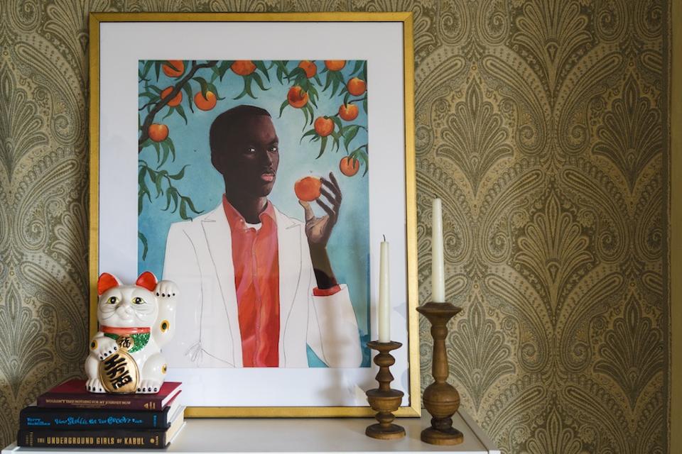
Art on a shelf.
Framebridge
Art is all about breaking the rules, so why not break the rules of art and stop limiting its use to walls? “Not only can you hang frames on the face of a bookshelf, closet door, or even on a bulletin board, but you can and should lean them pretty much anywhere they fit,” Tessa Wolf, creative director at Framebridge tells me. “We like to layer huge frames on a long empty wall like a hallway or next to a unique chair or piece of furniture in an alcove. And you can tuck small frames on bookshelves, mantels, or dressers for a really personal detail. This is our favorite way to sneak small family photos into a room. Leaning frames have a casual quality that can keep a space from feeling too formal or finished.”
Rule: Only Using Light Colors In A Small Room
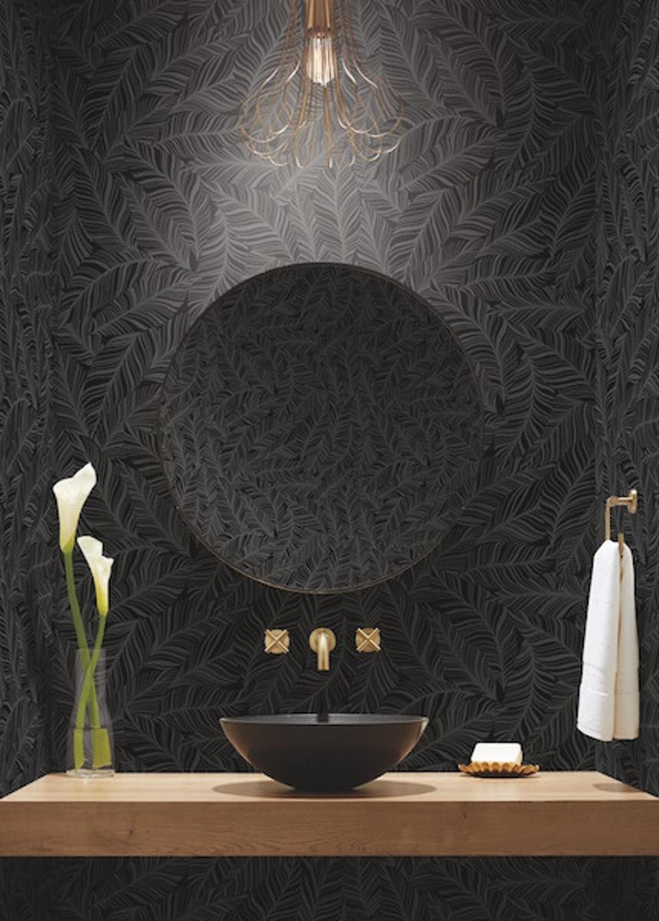
York Rainforest Canopy wallpaper available through DecoratorsBest
York Wallcoverings/DecoratorsBest
Using only light colors in a small room is a rule that many people think they need to follow because they’re under the impression that dark colors make a room feel smaller, but according to Barbara Karpf, CEO & Founder of DecoratorsBest, that’s simply untrue. “A dark color can conceal the boundaries and corners so that the room appears larger. The deep color camouflages the smallness and creates the perception of depth. Add a dark-colored grasscloth for texture and the tiny room turns into a gem,” she says.
Beth Diana Smith, interior Designer and HomeGoods Style Expert is also a proponent of breaking this rule. “Painting a room a dark color can actually give the room more depth, creating the perfect dramatic and sophisticated backdrop to layer in color, texture, and pattern through furniture and décor.”
When Smith is working with dark walls, she likes to use brightly patterned area rugs so color radiates from the floor, as well as style lighter wood furniture with woven texture to pop against the darker wall. “For rugs and accent furniture pieces, HomeGoods is my go-to place. They have the brands I love, with quality pieces that fit my maximalist aesthetic, which allows me to experiment with all the fun colors and textures without breaking the bank,” she says.
Rule: Painting Ceilings A Neutral Color
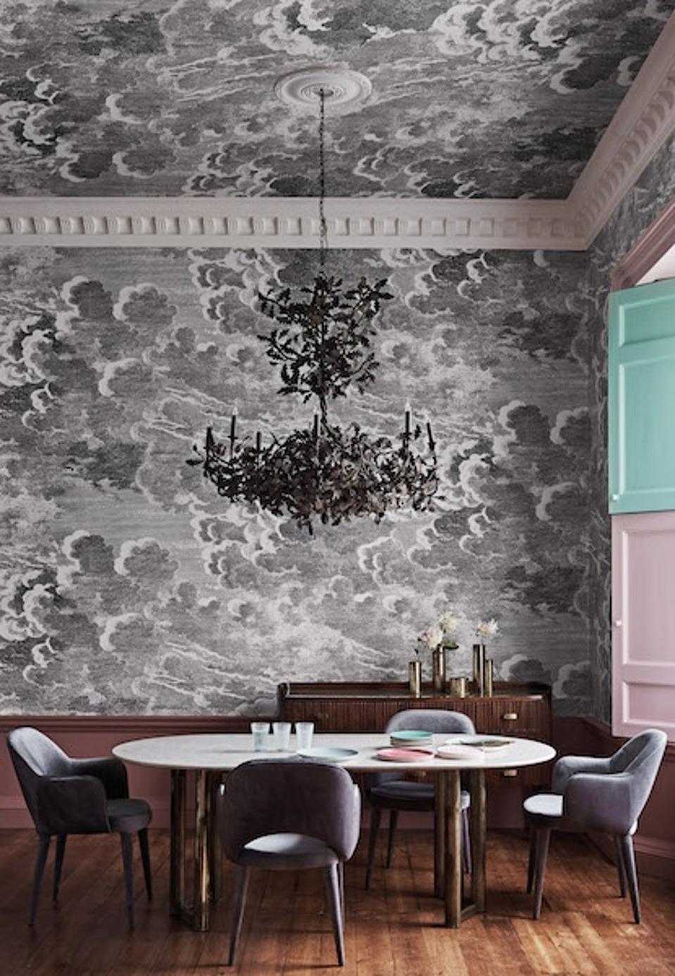
Cole & Son Nuvolette wallpaper available through DecoratorsBest
DecoratorsBest
White and eggshell ceilings are boring, so why not use this space as an opportunity to do something bold? “Ceilings are often referred to as the fifth dimension and can be an integral part of the design,” explains Karpf. “Striped wallpaper [for example] creates a tent-like look and an allover strong pattern adds character. [You can also] visually improve a room’s proportions with metallic wallpaper and hide awkward angles with scenic design.”
Rule: Faux plants have no place outside
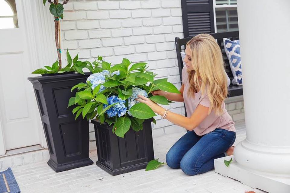
Jenny Reimold mixing faux and real plants.
HomeGoods/Jenny Reimold
Outdoors is for real plants only, right? Wrong. According to Jenny Reimold, lifestyle expert and HomeGoods Style Expert, one of her best outdoor styling hacks is mixing up real and faux plants. “For a front porch, I like to use artificial trees and faux plants from a store like HomeGoods. When I’m there, I know the faux plants are high quality and budget-friendly, which means I can get as many as I want in a variety of sizes and types. I style them in woven, ceramic, or clay planters where they can live amongst the natural greenery to add fullness.”
Rule: Only Use Matching Metals
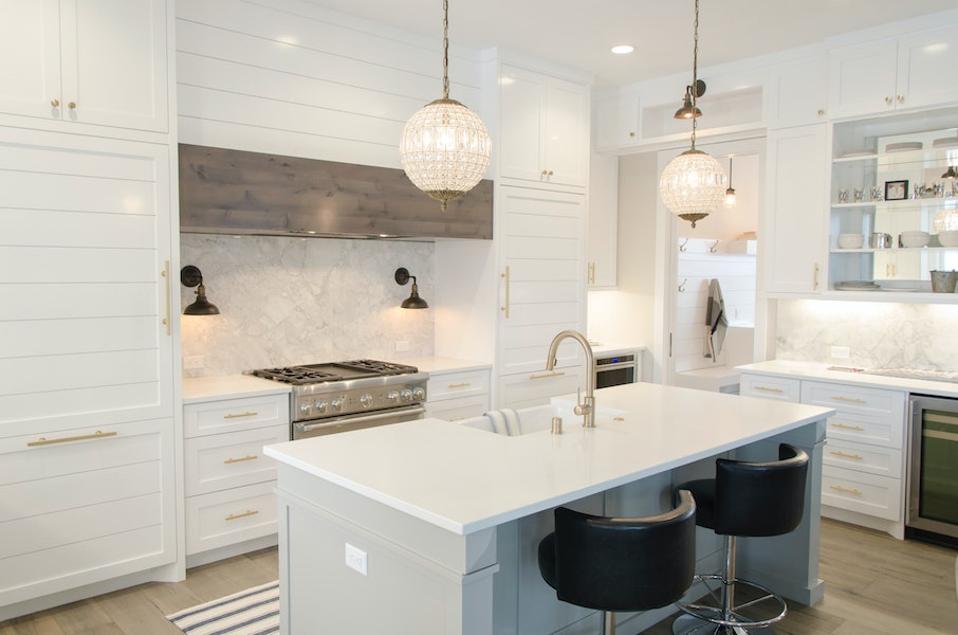
Mixed metals
Aaron Huber for Unsplash
Many people think that they can’t mix metals, but that’s simply untrue. Interior designer Liz Caan, says this is a rule to break. “Go ahead and mix silver, nickel, brass, bronze, and iron.”
Rule: Opt For A Neutral Rug With A Simple Pattern
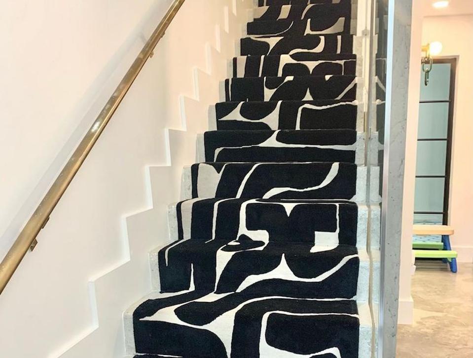
This rug is anything but neutral.
Art + Loom
Rugs are a great way to tie together a room, but that doesn’t mean they need to remain neutral. “Area rugs give you an opportunity to add playfulness, creativity, and a unique aesthetic into the room,” Samantha Gallacher, founder of IG Workshop and Art + Loom tells me. “It is often hard to think of the floor as ‘art’ as many often think of carpet as a functional piece vs. design. However, a bright-colored carpet or fun pattern can add liveliness to any room. There are endless possibilities today, with varying materials, fabrics, and sizes, and shapes, go crazy!”
