Poll: Box Art Brawl #74 – Ghost Trick: Phantom Detective

Welcome to the first 2021 edition of Box Art Brawl. This is our weekly-ish look at two or more retro gaming cover variants from around the globe, and we’ve got another three contenders lined up to duke it out for your vote.
Last time, we took to the slopes for some festive 1080° Snowboarding on N64. Ultimately, it was North America and its CG ‘boarder which brought home the bacon with close to half of the overall vote; Europe and Japan shared second place on the podium with 28% each (at the time of writing there’s only one vote in it).
This week we’re looking at a Capcom gem from the Nintendo DS’ catalogue: Ghost Trick: Phantom Detective. It featured high up on our reader-ranked Best Nintendo DS Games list, and next week is the 10th anniversary of its western release (11th January 2011 in North America, 14th in Europe). It’s a fantastic game from the mind of Shu Takumi, the director behind Phoenix Wright (and the attorney’s Japanese voice). Ghost Trick is a great touch-based puzzle adventure game and available on mobile devices these days if the DS version is a little too pricey for your tastes.
C’mon, let’s head back to the land of the living…
Japan

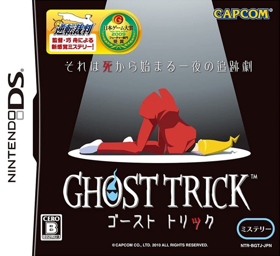
Starting in Japan (where the game released in the summer of 2010), the body of protagonist Sissel lies under a spotlight on a black stage with his derrière propped up towards the light. It’s a stark, simple image that plays in nicely with the setting of the game. The sticker at the top which highlights that Ghost Trick comes from the director of Phoenix Wright provides a little visual pep and colour, but remove that and you’re still left with an elegant, effective cover.
Europe

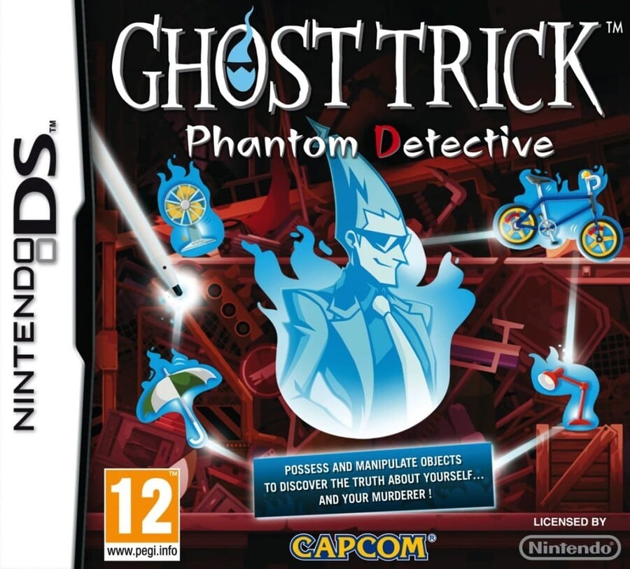
The European version more explicitly describes the gameplay through the possessed objects surrounding the ghostly Sissel, and there’s a text box below explaining things in black and white for anyone slow on the uptake.
It uses the same logo with the spectral head in the ‘O’, and each individual element is relatively strong, although they arguably get a little lost and it loses the simpler Japanese cover’s sense of identity. Not bad, just not better.
North America

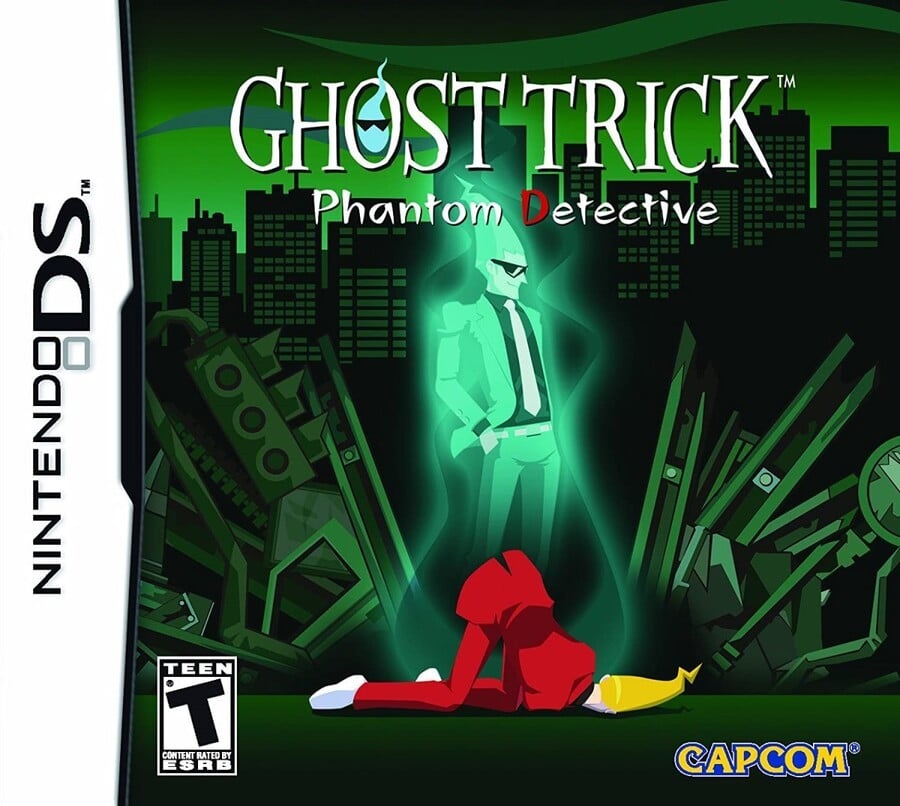
The implication of the Everafter that comes from the spotlight and black background on the Japanese cover is made more obvious on the North American version, with Sissel’s ghost standing above the same art of the crumpled body. The background conveys that you’re in for a modern day urban detective story, and the logo has been reduced in size, presumably to give you a better look at the skyline.
Again, not bad but could be better. The random street signs and material surrounding Sissel feel overly prominent to us.
So, you’ve seen the options, but which one does the trick for you? Pick your favourite and hit ‘Vote’ to let us know below:
We hope you’re making the best of the new year, whatever your situation. We hope you have the best week possible and we’ll see you next time for another bout of box art brawlery.
